AT&T DESIGN SYSTEM
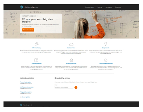
This is the story of how my team, Digital Styles & Standards, consolidated 47 different style guides into 1 centralized, first of its kind AT&T Design System and introduced efficiencies that resulted in 30% cost savings across the enterprise - and my role as the Product Owner Delegate.

STYLE GUIDE CONSOLIDATION
Once the team had identified which of the 47 style guides would need to be retired and which were still providing value, a Pattern Gap Analysis was performed, in order to compare patterns and identify pain points, inefficiencies, areas of design overlap, and opportunities for improvement.
As a result, a core group of designers were identified to document which patterns would be most effective, globally-speaking, for the majority of instances across the applications.
DESIGN JAM
Next, the team hosted an enterprise-wide Design Jam across the Consumer and Business organizations, gathering cross-functional creatives from various backgrounds, distribution channels, and product teams to brainstorm the look and feel for the new AT&T Design System.
Designers were encouraged to sketch out potential layouts, components, and interactions using various levels of fidelity to solve for the ways in which a user might engage, interact, find, and navigate the system.
Leadership from the enterprise and the team determined the most effective designs and put them to vote in real time, with the most inspiring concept setting the visual tone for moving the project forward.

TOOLKITS AND GUIDELINES
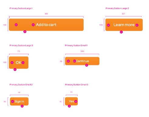
Applying the Gap Analysis, a list of essential pattern components were prioritized and the team began the iterative process of creating design guideline documents, defining 40+ components: from buttons, button groups, and badges to marquees and modals.
As this backlog continued to build, the effort of prototyping a web-based delivery system, began to take shape based on the inspiring work from the Design Jam.
The team also began to define a soft content strategy for each of the patterns: taxonomy, definition, usage examples, best practices, code snippets, editorial, and accessibility.
CARD SORTING AND TREEJACK STUDIES
In order to simplify the categorization of 40+ patterns, the team conducted open and closed card sorting research studies with a panel of 15+ projected internal users of the new system to determine how to better categorize and organize the consolidated patterns and various design elements.
Additionally, after evaluating feedback from the card sorting studies, the team performed a tree jack study to consider engagement, points of entrance, findability of content, and points of frustration, fallout, or exit.
PATTERNS TO COMPONENTS
With user research helping the team define the navigation and a prototype shaping up, various members of the team began to collectively define the overall look and feel of the new design system.
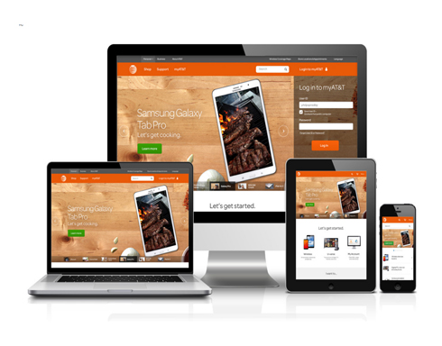
Creative reviews were setup with leadership to move the pattern guideines from an isolated set of PDFs to a vetted, interactive showcase of components for enterprise teams to access, share, and implement as a new digital design language.
Additional content inputs from external teams were looked to for enhancing enterprise knowledge of the Brand logo, colors, typography, and iconography, as well as Accessibility requirements, and Editorial best practices.
LAUNCH AND LEARN
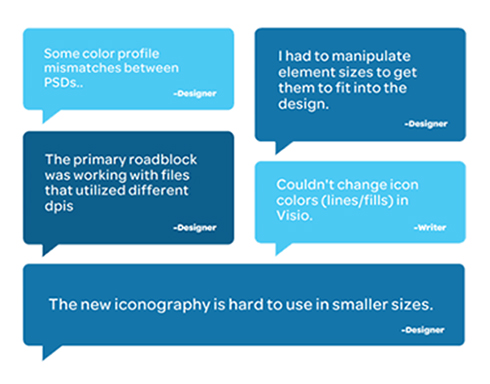
With everything in place, the team began the final phase of implementing pattern content. And, within a few months, the new Design System emerged online with the first 10 components, vetted and ready for enterprise distribution.
By following a design thinking approach, the team was able to do what was thought to be impossible: centralize best practices, streamline designs, improve collaboration, enhance the user experience, and introduce production cost savings across the enterprise.
With the final touch of operational management to address adoption, governance, process, and release management, the AT&T Design System remains up-to-date for designers, developers, and creative agencies to align with the modern needs of AT&T users.
MY PROJECTS
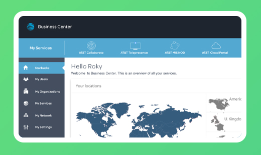
AT&T BUSINESS CENTER
How my team reduced clicks to manage port speeds from 20 clicks to 10 and increased revenue by a staggering 767% YoY.
View case study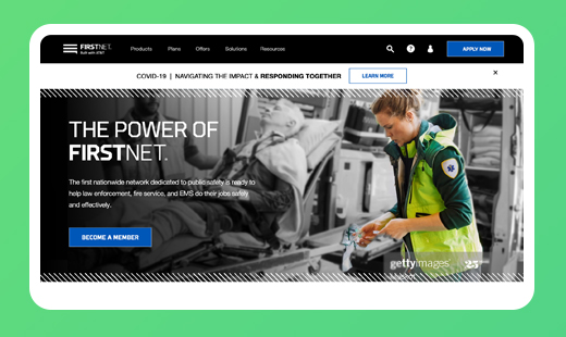
FIRSTNET HOME
How my team redefined the FirstNet content strategy, to increase account subscriptions by more than 19%, YoY.
View case study
